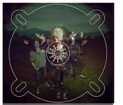
I have moved my original ideas to my new group and incorporated them into the music video. One of the ideas is the overlaying of images, I had done this in my digipack on the CD panel page, I thought it would be a good effect to put on to the video as the persona that they had created is a spiritual person. This would mean that we could implement a theme of nature and spiritual ideas while she is singing. 


Both my video and my ancillary task use earthy colours, although they are in different genres there is a hint of similarity between both tasks. In both tasks clouds and the grey sky seem to be a main element. This is because it connotes different things when added to other elements. In the ancillary task it connotes darkness in the music but also a dark theme to the band. Whereas in the music video it connotes spirits and rumbling skies and spiritual meditations.
Green, clouds, sky (grey)
Both of my tasks have a texure to them, in the Ancillary task the texutre is in the layering of the images and of the use of the paintbrushes to create a more textured feeling to the tea stained paper. By doing this the digipack and the poster have more depth to them. In my music video on the other hand the texture comes from the layering of the images but also the colours that have been used, the dark colours of the sky and the nature really makes the artists lips 'pop'. Also the dark colours allow the the light colours in the shop to stand out more allowing them to look more 3d and shapes them well.
No comments:
Post a Comment