My coursework has changed drastically throughout this year, at the beggining of the year my group was made of three, it then went to two and it was then just me after christmas as i moved into a new class. While I wished to have carried on making my original video it was too complex for me to make by myself and I was running out of time to film it all and edit. While I really liked my original idea I do think that it was too complex for me to do as it meant relying on other people and as I learnt, not everybody is really willing to commit to the work load, instead they liked the idea but did not really want to put the work in.
My ancillary task of the CD cover was supposed to have a number of images of the band on it, however it turned out the band was unreliable and rarely showed up when needed. This meant that I had a lack of images to fill my CD cover pages. To resolve this I found myself a new band and took less pictures of them and decided that I would do something else on the page that was supposed to have the photos on.
So from this I found that I over estimate what I can achieve and so if I was to do this all over again I would make my ideas less complex. Therefore my ideas would stay the same and I would not have to re evaluate what I was doing all of the time.
Tuesday, 22 March 2011
Friday, 21 January 2011
How did you use media technologies in the construction and research, planning and evaluate stages? (Music Video)
Research (Original Idea)- As part of my research I looked at different band websites, in order to get a feel as to how the bands promoted themselves on the Internet as well as in magazines and their CD covers. I also used Youtube to watch videos from my genre and to collect screen grabs from the videos in order to recreate them in my video. I also looked at pages such as Wikipedia and Google Images. I used Wikipedia in order to get some background information on bands and also the genre that I was going to create my music video in. I used Google Images as a way to see what kinds of images come up of the artists. Pictures that are not censored by them but are images that the Media have taken and have put on to the Internet.


Planning (Original Idea) - While planning all the details of my music video I wanted to make sure that I got the costuming correct for the audience that would be in my video but also I wanted the correct costumes for the band themselves. So I looked at websites such as River Island, Top Man and New Look. I then used Microsoft word to annotate the images. I also sorted out for myself and Shelby to got to Camden in London to look at potential locations for the music video. However because there were so many people in the band and there was a lot of instruments and neither of us could drive we were going to film in London without the band and then we were going to film the band in front of the Green Screen and merge the two films together. In class one triple lesson we were given the chance to use the Green Screen as a practice before we started to film. So myself, Charlotte and Wesley sang in front of the screen to create a band. We were then given a tutorial in using FinalCut and the Green Screen and how we could merger the two together.
Construction (New Group)- In the construction of my music video I used Final Cut. This was a different programme that used from last year, so it took a long time to work out how to use it comfortably without getting stressed when something goes wrong and having to ask for help. The first screen grab that you can see is from when I was uploading my film. Importing my footage into Final Cut was a long process as we had to upload it into IMovie and then transfer it into Final Cut. However this soon became second nature and it did not take me that long to do.
The screen shot below is of me editing a frame in the second verse, in this I have just added effects to the frame and I had to render it after so that the programme could play the footage and so that I could make sure that it looked good with the rest of the footage.
The screen shot below shows the feature on how to reverse a clip so that the artist is running backwards rather than running forwards. I used this to make my section of the video more interesting instead of seeing the artist going forwards all of the time the artist goes backwards. I used this in the parts of the music that were just instrumental this would make it more quirky.
Evaluation (New Group)-
Once I had finished my video I needed to merge it together and then upload it onto Youtube.
The media technologies that I used for evaluating my music video can be found on the Internet, once it had put onto Youtube, I then put a link onto Facebook and asked my friends to watch it and tell me what they thought. I would then also put my Music Video onto blogger so that other people in my class could see it as well as my teachers. I also used a Video camera to film people's responses to my work, by doing this i created a new way in which the infomation was to be shared about what people thought of my video.
How did you use media technologies in the construction and research, planning and evaluate stages? (Ancillary Task)
Research- When researching different CD covers and Posters I used the Internet to find different CD Covers and then I used Microsoft Word to annotate them and take ideas from them. By doing this I had a visual document of things that I wanted in my music video. I used websites such as HMV and Allcdcovers.com in order to see the CD covers. For the Poster I looked music magazines and posters that could be found on the Internet I also looked at the flyer's and tour posters that had been put up in Brighton and in Plymouth when I was there. For both I looked at bands website pages and their Facebook pages, by doing this I got feel for how bands advertised themselves and how I could use this knowledge when advertising my band.
Planning- The image below is of myself and Shelby planning what our ancillary tasks were going to look like, for this we used paper and pencil. For most of the planning of our ancillary tasks we used pencil and paper. I used a scanner to scan my designs into the computer to upload them onto blogger so that I always had my original designs for me to refer back to if needed. For planning I mainly used Blogger to hold all of my notes and ideas for the Ancillary tasks.


Construction-
When constructing my ancillary tasks I used DaFont, in order to find myself the perfect font for the band name and the album name. Once I had found these fonts i realised that i could use the font Smile (that was my band name font) as a brand for the band. I decided that this would be the font that the Band name was going to be written in at all times. Also when constructing I used Photoshop this made it easier in creating the digipack and the poster as it had all the tools that I needed. However at first I found it very difficult to use as it was a bit confusing however after a tutorial I was able to use the programme freely to produce the work that I did.
Evaluation-
When evaluating my final products I used Facebook to upload the images and ask people for their opinions. I also used a still camera to show my target audience looking at the final products and telling me what they thought about my ancillary task.
What have you learned from you audience feedback? (Music Video)
After watching my video these are some of the comments that people had...
"The artist looks like Florence, from Florence and the Machine"
"The video is great, I like the costumes and the different locations"
" It looks quiet professional"
"The editing looks good, I like the layering of the two images"
"Personally my favourite part of the video is the frame that has the mirror and the artists face in it. It close to the end. I like it because the mirror frames the shot."
"The video is good however some of the lip syncing is out of sych"
"In some of the shots the it looks like the artist has forgotten her lines or does not know the lines"
While the feedback was not all great, I realised that my project was not going to be perfect and if I had retrieved the feedback earlier I would have been able to change it so that the problems did not occur. My intention was to put my work up on to Facebook, however I never put it up and therefore I have recieved only a limited amount of feedback from my audience.
What have you learned from you audience feedback? (Ancillary task)


I wanted my band to have an image/ logo that would be associated with them, from the look at of my CD cover I decided that I was going to use a heart as most of the songs talk about love and emotions.
Also the font on the CD cover is almost child like, so i decided to make the heart myself rather than finding the heart on the Internet and manipulating it.
After asking my audience what they thought i decided to later incorporate it into my Music Video as the stamp that would be used for the concert scene.
Instead of just using a filter to make the background of my CD cover, I tea stained a piece of paper and screwed it up took a photo of it and then manipulated parts and made it more transparent so that colour behind it showed giving it an old look to it.
I asked my target audience a range of questions to allow my work to be the perfect example of a an alternate genre DigiPack and music video. The first question I asked was about the fonts did they think I should use for the band name and album name for the CD cover and Poster.
In the end they choose Two Turtle Doves (first on the top picture) for the album name and Smile for the band name (first on the second picture). These two fonts are very different and allowed me to distinguish a difference between the band and the album .
Audience-
From taking influences from many different genres I have created a band that will have a varied target audience. I thought this best as then I could use all the things I love about different bands and put them into one band. I created the band to target people like myself, someone who listens to a range of music. For example, I listen to Grime, Hip-Hop and R'n'B (N-Dubz, Example, Beyonce Knowles) but I also listen to Rock, Indie and Alternate music (You Me At Six, The Kooks, Kings of Leon). By creating a band that has elements of all of these types of music, albeit my band is more on the Rock, Indie and Alternate scale than the Grime and R'n'B scale.
How effective is the combination of your main product and ancillary task?
As noted before my ancillary task and music are from different genres as I moved groups later on in the year. However in my original idea there was a theme that was to be followed between the two ancillary tasks and the music video. The heart below was to be used as a stamp in the video at the concert, this was because it was going to be used as a motif that would appear in all of the videos somewhere. It also appeared on the thank you section in the CD cover, this was to reinforce the motif. 


I have moved my original ideas to my new group and incorporated them into the music video. One of the ideas is the overlaying of images, I had done this in my digipack on the CD panel page, I thought it would be a good effect to put on to the video as the persona that they had created is a spiritual person. This would mean that we could implement a theme of nature and spiritual ideas while she is singing. 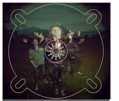


Both my video and my ancillary task use earthy colours, although they are in different genres there is a hint of similarity between both tasks. In both tasks clouds and the grey sky seem to be a main element. This is because it connotes different things when added to other elements. In the ancillary task it connotes darkness in the music but also a dark theme to the band. Whereas in the music video it connotes spirits and rumbling skies and spiritual meditations.
Green, clouds, sky (grey)
Both of my tasks have a texure to them, in the Ancillary task the texutre is in the layering of the images and of the use of the paintbrushes to create a more textured feeling to the tea stained paper. By doing this the digipack and the poster have more depth to them. In my music video on the other hand the texture comes from the layering of the images but also the colours that have been used, the dark colours of the sky and the nature really makes the artists lips 'pop'. Also the dark colours allow the the light colours in the shop to stand out more allowing them to look more 3d and shapes them well.
In what ways does your media product use, develop or challenge forms and conventions of real media products? (Ancillary task- CD cover)
Use- I have used aspects of some of the CD covers that are already on the shelf in the shops. I decided to do this to enforce that my band will have a wider appeal to a large target audience rather than having a niche audience. Below are the influences that I have had. Another use that I have used is that I had hired a photographer to take the photos of my band. I decieded to this as it would mean that I would get better images of my band but also I would be doing what they do in the media industry. 

I develop the use of the conventions of a CD cover as I use images of the band however on the CD placing I have overlayed two images to give it a better effect. I also have a page in the Digipack that is for the thank yous that the band may say to fans. I have carried this on as I wanted to make sure that my digipack stayed authentic to the normal conventions. 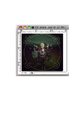

My front cover challenges the conventions of a CD cover as my front cover has an image that I have created that ties the Poster and the CD cover together rather than having an image of the band on it. Usually when a new band comes on the music scene there faces are on the CD cover and the poster. I decieded not to do this as it would make it more interesting and different to other covers and therefore make it stand out when on the shelves in the store.
Audience-
From taking influences from many different genres I have created a band that will have a varied target audience. I thought this best as then I could use all the things I love about different bands and put them into one band. I created the band to target people like myself, someone who listens to a range of music. For example, I listen to Grime, Hip-Hop and R'n'B (N-Dubz, Example, Beyonce Knowles) but I also listen to Rock, Indie and Alternate music (You Me At Six, The Kooks, Kings of Leon). By creating a band that has elements of all of these types of music, albeit my band is more on the Rock, Indie and Alternate scale than the Grime and R'n'B scale.
In what ways does your media product use, develop or challenge forms and conventions of real media products? (Ancillary task- Poster)
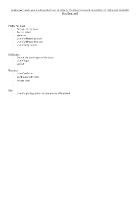 My Ancillary task challenges the concept of a magazine poster as it does not have any images of the band on it. I decided to do this as it is something different and also I wanted my poster to have a link to the CD cover. The link to my CD cover is the time bomb heart that is in black, I used this as a literal meaning from the album name.
Another challenge that my poster has is the layout, this is because I decided to have a more random layout as I wanted my band to be known as being more random than other bands that are out at the time. My poster is random in that the layout is different to others with the position of the Name of the band running down the side rather than it being in the middle or at the bottom. The rest of the writing is slanted in different positions of the poster this is something that is not usually used in other posters. Therefore something random and new.
It Uses the conventions of a poster as it uses a continuity through the use of fonts and font sizes. While I use the convention of a website something that would make it easier for the audience to follow the band and something the media product already uses, I developed it so that it was in colour (green) this was because I wanted it to stand out rather then blend into the poster.

I also used the convention of the band name and album name, however I developed it so that it was not in the conventional places instead the band name was down the side of the poster and in green, also the band name used a modern day symbolic smiley face. I also have used the font SMILE from DaFont, I have used this font through out my digipack and Poster so that I created a recognisable brand that the band would be associated with. This appeals to my audience/ fans as it is not girly/ to manly, instead it is a gentle mix of elements that appeal to both girls and boys. Also it appeals to many different people as it is not to in your face and is not to typical of a genre.
I also developed my work by making more institutional as I have added, the record label and the ticket master website on it.

In what ways does your media product use, develop or challenge forms and conventions of real media products? (Music Video)

Conventions of a music video:
- Lip Syncing
- Various locations
- Performance
- Artist in the video
- Close-ups
My video has used the conventions of a normal music video in that there is still loads of lip syncing, various locations, performance and close ups. The performance however is more of the artist singing to the camera creating that moment of pleasure for the audience. We have also used the same editing process that all the music producers use when editing their music video, by doing this we were able to make it to the same standard that they are made in the music industry.
We have developed the idea of the various costume changes however in this video the artist keeps changing her outfit. This works well as she is wearing a new outfit in each new location, this was more of a coincidence that occurred when filming. We developed the idea of nature in our video, we did this by overlaying some of the images of the artist with some of the images of the different bits of nature that we filmed. By doing this we made the artist look powerful and spiritual.
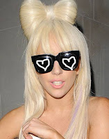
We challenged the conventions of the genre by using the influence of Lady Gaga and her many masks that she wears covering her face. We decided to only have the mask cover her eyes instead of her whole face. The mask on the artists face gave an essence of mystery to her. We also challenged it by taking influences from two genres and putting them together to make one very different genre, by doing this our target audience becomes wider as it mixes two different genres together but still keeps the vital parts of both genres.

Editing
Thursday, 20 January 2011
Changes in Groups ...
This blog is to highlight that there is a difference in my tasks as i have been moved classes and the rest of my group has dropped out of school. I would have carried on with my initial music video however it was too late in the year and we had done hardly any filming and my video was too complex for me to film by myself. Which would have meant that i would not have finished it and it would not have been done to the best of my abilites.
However i did carry on with my ancillary tasks as before as i had already started them and i had nearly finished them. This means that the two pieces of coursework that i am submitting belong to too different genres and not the same.
I joined Laura and Siani's group and the genre that they were doing was Indie. In this group I have filmed some of the later filming that took place and have edited a Verse and a Chrous by myself.
All of my research and planning tasks are to do with my ancillary task of my CD cover and Advert Design. However task 15* is a post about the genre of music that i am doing my music video on, so that myself and you (the examiner) will know what conventions i should follow in my music video.
Wednesday, 19 January 2011
Ancillary Task- Magazine Poster

This is my final magazine advert, this would appear in a magazines such as Kerrang!, Rolling Stone, MOJO (the music magazine). This advert fits into these types of magazines as these magazines have done articles on this type of genre they have also done features on bands that are like my band Half Hour Stay -_-
Subscribe to:
Comments (Atom)


